Sorry for the absence--I was waiting for First Look data to continue my custom graphing explanation. OK, OK...that's not true...I just got behind on other things and neglected the blog. I apologize to the Custom Graphing Jedi-in-training. I hope you continued your studies while I was gone.
But, it is true that First Look is ready. I just downloaded the First Look file and now have over 3,000 credit unions to analyze using 2Q data. For you data & analysis nerds out there, now is the time to start raggin' on your colleagues that DON'T use Peer. Light up the CFO listserv with 2Q fun facts that only YOU know, while they struggle to use NCUA.gov to get data. Ok, enough trash talking. Back to Custom Graphing.
Where were we? I've covered all the Single Credit Union or Peer Group charts, as well as the various Historical tables. Let's move on to Lists under both All Comparisons and Detailed. First a quick note about the difference between the two sections.
All Comparisons: By default, these graphs will show data for the primary and any comparisons you have selected. The CUs within those Peer Groups, by default, do NOT show on these charts. However, you can add them simply by selecting "Include all credit unions that comprise the selected comparisons" on the Account Selection screen. In essense, you've just upgraded to the Detailed group of graphs.
Detailed: By default, these graphs will show data for the primary and ALL the CUs that make up the comparisons, but NOT show the comparisons if they are an aggregated Peer Group. You can also add in the Peer Group averages by selecting "Just show selected comparisons" on the Account Selection screen. This is really mislabled in this case and should "Also include selected comparisons". I'll suggest that to the team.
Wow. I'm tired just writing that. Ok, on to the custom graphs. Alpha & Leader Tables.
Basically the same thing, but one sorts the data alphabetically by default; the other sorts by the first account code, highest to lowest, to create a ranking report. Pretty straightforward. In addition to the difference listed above (All Comparisons v. Detailed), you can always click on any column header to sort the data by that row. So, for accounts where LOWER is better (delinquency, efficiency etc.), just click that column header to reverse the listing.
Showing posts with label custom graphs. Show all posts
Showing posts with label custom graphs. Show all posts
Monday, August 3, 2009


Tuesday, July 21, 2009
Custom Graphing: Historical Charts (love these...)
While you toil away at your Jedi training, I am (probably) enjoying a view of the Swiss Alps. At least that's the plan. I'll let you know the reality when I'm back State-side on Thursday.
Ok, today's lesson: History tables. There are two...and a great way to access data that you can export to excel to manipulate (for good....not evil...keep repeating.) I demonstrate a way to use this report to calculate quarterly values for accounts reported YTD in a previous blog post.
 With the first option, Single CU/PG History, you create a table of values for multiple accounts for a single entity over time.
 The second option, All Comparisons History, creates a grid of historical values for a single account for all your comparisons. WARNING: Do NOT select "Include all comparisons that comprise the selected comparisons" on the Account Selection screen unless you have a SMALL peer group selected or PLENTY of time to let Peer run. (I don't think the original specifications even meant for that option to be available ... )
 Why would you use this? Couple reasons I can think of...As I said in a previous blog post, Peer can do a lot but sometimes you need to put data in Excel to create a specific graph. This report allows for a quick pull and export.
I use this report a lot to spot data inconsistencies. Example: I was helping a client pull data on mortgage sales on the secondary. There was a huge bump in one quarter so I pulled an All Comparisons Historical report to see the underlying data. Found that one CU had reported their YTD sales incorrectly back in 2003 by adding an extra zero (I verified against NCUA's report--it's still wrong there too).
How do you use these reports? Would love your feedback. Please comment.
Ok, today's lesson: History tables. There are two...and a great way to access data that you can export to excel to manipulate (for good....not evil...keep repeating.) I demonstrate a way to use this report to calculate quarterly values for accounts reported YTD in a previous blog post.
 With the first option, Single CU/PG History, you create a table of values for multiple accounts for a single entity over time.
 The second option, All Comparisons History, creates a grid of historical values for a single account for all your comparisons. WARNING: Do NOT select "Include all comparisons that comprise the selected comparisons" on the Account Selection screen unless you have a SMALL peer group selected or PLENTY of time to let Peer run. (I don't think the original specifications even meant for that option to be available ... )
 Why would you use this? Couple reasons I can think of...As I said in a previous blog post, Peer can do a lot but sometimes you need to put data in Excel to create a specific graph. This report allows for a quick pull and export.
I use this report a lot to spot data inconsistencies. Example: I was helping a client pull data on mortgage sales on the secondary. There was a huge bump in one quarter so I pulled an All Comparisons Historical report to see the underlying data. Found that one CU had reported their YTD sales incorrectly back in 2003 by adding an extra zero (I verified against NCUA's report--it's still wrong there too).
How do you use these reports? Would love your feedback. Please comment.
Friday, July 17, 2009
Custom Graphing: 3 Column Charts for Single CU/Peer Group?
There are 3 different column charts under Single CU/Peer Group. Let's take a look at the difference between them:

1. Single Cycle: This one shows you a different column for each account in a single cycle. Not sure how often you'd use...but here's an example to show the total $ outstanding for various components of the loan portfolio.

2. Historical: This one is more useful. It shows you multiple accounts going back over time for a single CU or PG. This is the same as the line chart next to it. I usually use columns when measuring balances and the line for ratios. Not sure why...Here are 2 examples:

 3. Stacked Column (Historical): My favorite. Use this to look at composition changes historically. Here is an example showing the changing composition of the average credit union share portfolio over time. (I'm using the "All US" peer group...thus the 'average' composition for the entire industry). Note the shift toward share certificates starting in 2006...
 Bonus! I just learned something myself. You can use the Type menu above this chart to turn it into a stacked area chart. This yields the same result as having selected the Area Chart. Yay. Once less blog post.

Note: the Account Selection screen is the same for all of them...just realize when you select type 2, each account code you is a different column. For type 3, each account code is stacked on top of the others, rather than next to them.
And with that bonus find, I'm treating myself to a 3-day weekend (I'm actually on a 7-day vacation as you read this but I felt compelled to prepare tips for my 3 loyal Jedi-in-training while I am overseas.) My next post will be on Tuesday, July 21 and cover Historical Tables.

1. Single Cycle: This one shows you a different column for each account in a single cycle. Not sure how often you'd use...but here's an example to show the total $ outstanding for various components of the loan portfolio.

2. Historical: This one is more useful. It shows you multiple accounts going back over time for a single CU or PG. This is the same as the line chart next to it. I usually use columns when measuring balances and the line for ratios. Not sure why...Here are 2 examples:

 3. Stacked Column (Historical): My favorite. Use this to look at composition changes historically. Here is an example showing the changing composition of the average credit union share portfolio over time. (I'm using the "All US" peer group...thus the 'average' composition for the entire industry). Note the shift toward share certificates starting in 2006...
 Bonus! I just learned something myself. You can use the Type menu above this chart to turn it into a stacked area chart. This yields the same result as having selected the Area Chart. Yay. Once less blog post.
Note: the Account Selection screen is the same for all of them...just realize when you select type 2, each account code you is a different column. For type 3, each account code is stacked on top of the others, rather than next to them.
And with that bonus find, I'm treating myself to a 3-day weekend (I'm actually on a 7-day vacation as you read this but I felt compelled to prepare tips for my 3 loyal Jedi-in-training while I am overseas.) My next post will be on Tuesday, July 21 and cover Historical Tables.
Thursday, July 16, 2009
Custom Graphing: Ranking Report (ex. Productivity & Efficiency)
The Standing Report is easy to explain and one of the most helpful and powerful tables you can build in Peer 2. Understanding its power is key to gaining Jedi Knight status. But this post comes with a warning: you must use this Force for Good. Do not lured to the Dark Side. There is great temptation to keep its power secret from your colleagues so that you look all-knowing and powerful, while they slave away using excel spreadsheets for hours to produce similar information.
This report answers the question "What is your standing compared to your peers?."
So what does it show? The Standing Report compares your primary CUs performance in however many areas you want against all other CUs in the comparison sets. It shows your actual performance, rank out of the total # of CUs, the other CUs' average performance and what percentile your performance falls into.
Let's look at Productivity & Efficiency to tie together what you learned earlier in the week with the Formula Wizard post and today's lesson.
Begin by selecting the Standing Report. Click on the binocular image on the first line and navigate to Ratio & Scoring --> Productivity & Efficiency.
 Double-click on each formula you want to include on the report (you'll see each one you select pop into the window at the bottom.
 If you want to do more than 15 rows, you'll have to go back to the Account Selection screen and click "insert" for each new line you want to add (annoying).
 When done, give your table a title and select either Preview or Save. Voila! (my new favorite word).
 If you want to see how another CU in the comparison set performs, just use the drop down menu on the graph (which regrettably is sorting in descending asset order rather than alphabetically...submitted to fix desk).

This report answers the question "What is your standing compared to your peers?."
So what does it show? The Standing Report compares your primary CUs performance in however many areas you want against all other CUs in the comparison sets. It shows your actual performance, rank out of the total # of CUs, the other CUs' average performance and what percentile your performance falls into.
Let's look at Productivity & Efficiency to tie together what you learned earlier in the week with the Formula Wizard post and today's lesson.
Begin by selecting the Standing Report. Click on the binocular image on the first line and navigate to Ratio & Scoring --> Productivity & Efficiency.
 Double-click on each formula you want to include on the report (you'll see each one you select pop into the window at the bottom.
 If you want to do more than 15 rows, you'll have to go back to the Account Selection screen and click "insert" for each new line you want to add (annoying).
 When done, give your table a title and select either Preview or Save. Voila! (my new favorite word).
 If you want to see how another CU in the comparison set performs, just use the drop down menu on the graph (which regrettably is sorting in descending asset order rather than alphabetically...submitted to fix desk).
Wednesday, July 15, 2009
Custom Graphing: Single CU or PG + Composition Pie/Bar
My dear Padawan, I'm so glad you have expressed interest in being a Custom Graphing Jedi Master. Let us begin our training with the "Single Credit Union or Peer Group" section of Peer 2.0.
I am going to begin out of order, tackling the 2 composition charts in the middle first. They are the easiest to understand.

Say you want to look at current composition of your loan, share or investment portfolio (or that of your "competitor"--another CU or a peer group). Composition: Pie and Composition: Bar display the same information, just in different formats. Pies are traditional but honestly not nearly as easy to interpret as bar charts which make it very easy to see the relative size of each component. Let's do an example using the Loan Portfolio and the Pie chart.
First, click on the Pie image and Peer will take you to the Account Selection screen. Now, type in the formulas you want to include in the pie chart and the titles you want shown on the legend.
a396+a397 = unsecured debt
a385+a370+a002 = auto loans & leases
a703+a386= mortgage loans
a698 = other
(Not sure how to figure out account codes? That's another entry all together...click here.)

For now, keep "Just show selected comparisons" checked. I'll explain the other option in a minute.
Select "Preview" or "Save." Preview puts it in your Temporary Displays, Save will prompt you to select a folder in which to save it. Done.
 Ok, 3 things to play with.
1. By default, the graph is showing the actual $ values. If you'd rather see the %, simply use the Data Format drop down.

2. Change your mind and would rather see the bar chart? Select Type--> Bar.

 Hmm....bar charts should always sort largest to smallest...I'll have to submit a fix.
3. Want to look at one of your other comparisons? Simply use the drop down menu on the chart to change. Your primary and all of your comparisons will be on the list.

Ok, this brings us back to the radio buttons on the Account Selection Screen:

These radio buttons dictate what comparisons will be shown on the drop down menu on the chart (#3 above). If you just want to see your primary & comparisons, leave the top option selected. If you want to look at the individual credit unions that comprise your peer group comparisons, go ahead and add the second button. The only problem: your drop down menu will be mighty long depending on how big your peer group is.
I am going to begin out of order, tackling the 2 composition charts in the middle first. They are the easiest to understand.

Say you want to look at current composition of your loan, share or investment portfolio (or that of your "competitor"--another CU or a peer group). Composition: Pie and Composition: Bar display the same information, just in different formats. Pies are traditional but honestly not nearly as easy to interpret as bar charts which make it very easy to see the relative size of each component. Let's do an example using the Loan Portfolio and the Pie chart.
First, click on the Pie image and Peer will take you to the Account Selection screen. Now, type in the formulas you want to include in the pie chart and the titles you want shown on the legend.
a396+a397 = unsecured debt
a385+a370+a002 = auto loans & leases
a703+a386= mortgage loans
a698 = other
(Not sure how to figure out account codes? That's another entry all together...click here.)

For now, keep "Just show selected comparisons" checked. I'll explain the other option in a minute.
Select "Preview" or "Save." Preview puts it in your Temporary Displays, Save will prompt you to select a folder in which to save it. Done.
 Ok, 3 things to play with.
1. By default, the graph is showing the actual $ values. If you'd rather see the %, simply use the Data Format drop down.

2. Change your mind and would rather see the bar chart? Select Type--> Bar.

 Hmm....bar charts should always sort largest to smallest...I'll have to submit a fix.
3. Want to look at one of your other comparisons? Simply use the drop down menu on the chart to change. Your primary and all of your comparisons will be on the list.

Ok, this brings us back to the radio buttons on the Account Selection Screen:

These radio buttons dictate what comparisons will be shown on the drop down menu on the chart (#3 above). If you just want to see your primary & comparisons, leave the top option selected. If you want to look at the individual credit unions that comprise your peer group comparisons, go ahead and add the second button. The only problem: your drop down menu will be mighty long depending on how big your peer group is.
Tuesday, July 14, 2009
Custom Graphing: An Overview

Ok, for those of you ready to go beyond the built-in graphs, the next week will be devoted to custom graphing. The chart above is intimidating but once you get the hang of it, you'll be a Peer Jedi Master (I have 5 & 6 year-old boys...our world revolves around Star Wars the Clone Wars).
To become a Jedi requires the deepest commitment and most serious mind. It is not a venture to be undertaken lightly. As such, Jedi instruction is rigidly structured and codified to enforce discipline and hinder transgression. First, you are a Padawan; then you advance to Knight. The next level of rank in the Jedi order is the Jedi Master, reserved for those who have shown exceptional devotion and skill in the Force. May the force be with you.
Today: A quick overview of each "section" of the custom graphing.
Tomorrow and beyond, I'll do sample graphs from each section. (yes, I'm trying to spread out my posts...after all, I don't actually get paid for this but I may start negotiating with the software team! My motto: "I work for food").
To get to the custom graphing feature, go to "My Displays" on the left navigation pane. Click on Create New. You will be presented with the screen at the top of this post.
Single Credit Union or Peer Group
Use this set of graphs when you want to look at the performance of 1 credit union or 1 peer group on a graph or chart. The first set, Single/Current Cycle, allows you evaluate how you did in one particular quarter (by default, it's this quarter, but you can "cycle back"). The second set, Historical/Over-Time, allows you to see how your CU or PG performance changed over time, on multiple facets, for example loan growth v. share growth v. member growth.

All Comparisons
This set of graphs will plot your primary v. however many comparisons you selected. So, let's say you have 1 credit union as the primary and 4 peer groups (a standard asset based one, a geographic one, a FOM-based one and maybe a hand-selected set of CUs). The first set, Single/Current Cycle, will show you data points for all 5 comparisons for a single performance quarter. As above, the second set, Historical/Over-Time, allows you to see how all your selections performed over time, but this time in just a single facet.

So, quick example: The difference between the line chart under the top row and the line chart in the second row is this:
Top row: you can show multiple "lines" (eg accounts) for the same CU or PG on a single graph (loan growth v. share growth v. member growth). 3 Lines all for the same CU or PG. The middle row graph will also show performance over time, but rather than each line representing a different performance measure as above, this time, each line represents a specific performance attribute for each comparisons (share growth for the 1 CU and 4 PGs in the previous example.)
(Don't give up...the Force is with you...)
Detailed
Detailed graphs are similar in a lot of ways to the middle row, but rather than show the 5 comparisons selected in the previous example, these charts/graphs will show the data for ALL the credit unions within those 5 comparisons. So, Peer looks at your asset-based peer group and includes all those CUs in the table or chart; then it looks at your geographic one and throws the missing CUs on the chart; then it looks at the FOM and the hand-selected ones and adds any other CUs that are in those groups and not yet included. So, each PG might have 20 CUs (4 x 20 = 80), but collectively it's really just 60 different ones, not 80 when dupes are excluded. So these charts/tables will show 60 CUs.

One more confusing point: you can chose to include the Peer Group averages or not. That's what those options at the top of the account screen are for...more on that later.
Perfectly clear? Probably not...but until you start playing with these graphs, it won't be easy. Stay tuned, my young Padawan.
Sunday, July 12, 2009
Custom Graphing: The Account Selection Screen
The Account Selection screen is a necessary evil in the creation of custom graphs. Here's a quick overview.
 Graph Title: Ok, this one is obvious. It's the title on the graph.
Formula: This is where you type in account codes from the 5300 form credit unions report to NCUA as well as many "formula shortcuts" (eg. "assets", "loans", "shares". More on these shortly). I keep a print out of the 5300 on my desk, earmarked and highlighted. Don't have one? You can go to the help menu on Peer and print one out (including instructions). OR, you can use the binoculars, or "Formula Wizard". (I'll get to that at the end...I'm tackling the easy stuff in this post.)
Titles to Use: This is what will show on the legend or chart labels. If you just type in a simple account code like a703, Peer will automatically fill in a label for you (in this case "Total 1st Mortgage Loans Outstanding"). I usually retype them in shorter formats.
Format Type: This helps you format the output. Peer usually gets the format correct, but if not, you can change it yourself.
Arrows: Major upgrade from Peer 1--you can easily rearrange the items on your list using these arrows. Simply put your cursor on the item you want to move, and click up or down until it's in the right place.
Delete: Obvious--you can delete a row. Simply put your cursor on the item you want to delete.
Insert: By default, there is only space 15 items. You can add more by clicking Insert. It adds another row to the bottom.

These radio buttons dictate what comparisons will be shown on your table or graph. The output depends on the type of chart you selected, but in general: if you just want to see your primary & comparisons, leave the top option selected. If you want to look at the individual credit unions that comprise your peer group comparisons, go ahead and add the second button. If you don't want to see the Peer Group averages, uncheck the top option and only select the bottom one. This will remove the Peer Group averages from the display.
Binoculars/Formula Wizard: A bit of history: In Peer 1, rather than show a set of binoculars as the icon, it was a magic wand...thus the name "Formula Wizard". It really needs a new name like "Account Look-up Tool." In any case, this deserves a post of its own. Click here.
 Graph Title: Ok, this one is obvious. It's the title on the graph.
Formula: This is where you type in account codes from the 5300 form credit unions report to NCUA as well as many "formula shortcuts" (eg. "assets", "loans", "shares". More on these shortly). I keep a print out of the 5300 on my desk, earmarked and highlighted. Don't have one? You can go to the help menu on Peer and print one out (including instructions). OR, you can use the binoculars, or "Formula Wizard". (I'll get to that at the end...I'm tackling the easy stuff in this post.)
Titles to Use: This is what will show on the legend or chart labels. If you just type in a simple account code like a703, Peer will automatically fill in a label for you (in this case "Total 1st Mortgage Loans Outstanding"). I usually retype them in shorter formats.
Format Type: This helps you format the output. Peer usually gets the format correct, but if not, you can change it yourself.
Arrows: Major upgrade from Peer 1--you can easily rearrange the items on your list using these arrows. Simply put your cursor on the item you want to move, and click up or down until it's in the right place.
Delete: Obvious--you can delete a row. Simply put your cursor on the item you want to delete.
Insert: By default, there is only space 15 items. You can add more by clicking Insert. It adds another row to the bottom.

These radio buttons dictate what comparisons will be shown on your table or graph. The output depends on the type of chart you selected, but in general: if you just want to see your primary & comparisons, leave the top option selected. If you want to look at the individual credit unions that comprise your peer group comparisons, go ahead and add the second button. If you don't want to see the Peer Group averages, uncheck the top option and only select the bottom one. This will remove the Peer Group averages from the display.
Binoculars/Formula Wizard: A bit of history: In Peer 1, rather than show a set of binoculars as the icon, it was a magic wand...thus the name "Formula Wizard". It really needs a new name like "Account Look-up Tool." In any case, this deserves a post of its own. Click here.
Wednesday, July 8, 2009
Ooo....Pretty colors...
This is a post for all those designer types who don't just like what the data has to say, you want it to LOOK good too. (Or, you sit 10 feet from a designer who always gives you an earful when presentations aren't professional looking, like I do). In either case, this post is for you!
As you may have figured out by now, the default color settings for graphs in Peer 2.0 match Office 2007. That was purposeful. There is a lot you can do in Peer 2, but sometimes you need to export data and manipulate it in Excel or PowerPoint. With the default settings you don't have to do a lot of editing of colors to make it match between Peer 2 graphs and those created in Office 2007.
But what if you have a credit union "brand style sheet" that your presentations are supposed to match? Here's a quick way to change your default colors.
Go to Tools --> Graphics Settings --> Color Palette. Select New Palette.


Click on the little box next to Color 1 to get the standard Window's color picker. If you don't like the 48 default options, get creative and select Define Custom Colors. Here you can play around with all sorts of colors and shades, or just ask your Marketing Department for the RGB breakdown of your credit union's primary colors.
 Repeat for all 10 colors. Name your palette and select "Save as Default" (you can always switch back to the Windows Palette).
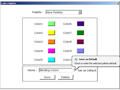 Voila!


As you may have figured out by now, the default color settings for graphs in Peer 2.0 match Office 2007. That was purposeful. There is a lot you can do in Peer 2, but sometimes you need to export data and manipulate it in Excel or PowerPoint. With the default settings you don't have to do a lot of editing of colors to make it match between Peer 2 graphs and those created in Office 2007.
But what if you have a credit union "brand style sheet" that your presentations are supposed to match? Here's a quick way to change your default colors.
Go to Tools --> Graphics Settings --> Color Palette. Select New Palette.


Click on the little box next to Color 1 to get the standard Window's color picker. If you don't like the 48 default options, get creative and select Define Custom Colors. Here you can play around with all sorts of colors and shades, or just ask your Marketing Department for the RGB breakdown of your credit union's primary colors.
 Repeat for all 10 colors. Name your palette and select "Save as Default" (you can always switch back to the Windows Palette).
 Voila!

Friday, July 3, 2009
How to share custom graphs with others (and import someone else's)
A .crc file is a way for Peer users to share custom displays (graphs, charts, tables) they created in their desktop version of Peer with other users. This way, users save time and energy by eliminating the needless duplication of effort. Here's how to create and share a CRC file.
First, I'm going to start with the assumption that you already have created custom graphs that you want to share. (Not sure? Go to My Displays in the left sidebar and check).
Now, to export the graphs is easy. Simply go to the File menu (top left as usual) --> Export --> Custom Displays. Select the folder of graphs you wish to export from the list on your screen. You have 2 options: Export, which will save the file to your desktop or anywhere you designate (a shared drive for example); or Email, which will open your default email browser with the .crc file as an attachment. Done!
Want to import graphs from someone else? I assume they sent you a .crc or you downloaded one from www.p2psoftware.com. Save the .crc somewhere you can find it (your desktop, for example). Now, simply go to File --> Import --> Custom Displays. Click Browse to find the file you just saved. Name it and click on Import. Done! These graphs will be saved under My Displays in the left navigation.
First, I'm going to start with the assumption that you already have created custom graphs that you want to share. (Not sure? Go to My Displays in the left sidebar and check).
Now, to export the graphs is easy. Simply go to the File menu (top left as usual) --> Export --> Custom Displays. Select the folder of graphs you wish to export from the list on your screen. You have 2 options: Export, which will save the file to your desktop or anywhere you designate (a shared drive for example); or Email, which will open your default email browser with the .crc file as an attachment. Done!

Want to import graphs from someone else? I assume they sent you a .crc or you downloaded one from www.p2psoftware.com. Save the .crc somewhere you can find it (your desktop, for example). Now, simply go to File --> Import --> Custom Displays. Click Browse to find the file you just saved. Name it and click on Import. Done! These graphs will be saved under My Displays in the left navigation.

Thursday, July 2, 2009
Calculating & graphing accounts reported as YTD amounts
For YTD account codes (such as 1st mortgage originations), there isn't an easy way to get quarterly numbers (this wasn't possible in Peer 1 either...i've already suggested a fix), so you need to use Excel to calculate and graph the data. Here's how to do it.
First, pull the data in a custom chart and export it to Excel. (Side note: to pull 1st mortgage originations, you can use the formula "a720+a721" even though the 5300 has a720a, a720b etc. We've created the shortcut for you).
 Next, in Excel, calculate the quarterly originations.
 Graph it. But, wait! The x-axis has the data formatted in reverse order--the graph has 2009 on the left and 2002 on the right.
 Fix it: Right click on the x-axis. Under Axis Options select "Categories in reverse order".
 ACK! The y-axis labels are now on the wrong side.

Fix it: Right click on the y-axis. Under Axis Options select "Axis labels: High" (I have no idea why...this one I had to figure out with experimentation.) Voila! A gorgeous graph that shows the Quarterly 1st Mortgage Originations.
First, pull the data in a custom chart and export it to Excel. (Side note: to pull 1st mortgage originations, you can use the formula "a720+a721" even though the 5300 has a720a, a720b etc. We've created the shortcut for you).

 Next, in Excel, calculate the quarterly originations.
 Graph it. But, wait! The x-axis has the data formatted in reverse order--the graph has 2009 on the left and 2002 on the right.
 Fix it: Right click on the x-axis. Under Axis Options select "Categories in reverse order".
 ACK! The y-axis labels are now on the wrong side.
Fix it: Right click on the y-axis. Under Axis Options select "Axis labels: High" (I have no idea why...this one I had to figure out with experimentation.)
 Voila! A gorgeous graph that shows the Quarterly 1st Mortgage Originations.
Subscribe to:
Posts (Atom)

 Posts
Posts

