As you may have figured out by now, the default color settings for graphs in Peer 2.0 match Office 2007. That was purposeful. There is a lot you can do in Peer 2, but sometimes you need to export data and manipulate it in Excel or PowerPoint. With the default settings you don't have to do a lot of editing of colors to make it match between Peer 2 graphs and those created in Office 2007.
But what if you have a credit union "brand style sheet" that your presentations are supposed to match? Here's a quick way to change your default colors.
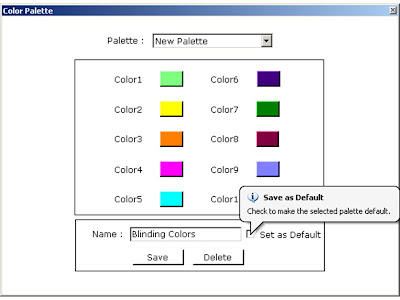
Go to Tools --> Graphics Settings --> Color Palette. Select New Palette.


Click on the little box next to Color 1 to get the standard Window's color picker. If you don't like the 48 default options, get creative and select Define Custom Colors. Here you can play around with all sorts of colors and shades, or just ask your Marketing Department for the RGB breakdown of your credit union's primary colors.
 Repeat for all 10 colors. Name your palette and select "Save as Default" (you can always switch back to the Windows Palette).
 Voila!


Hi, it's a very great blog.
ReplyDeleteI could tell how much efforts you've taken on it.
Keep doing!